Energy at a Glance — practical UI/UX for dashboards and widgets
We don’t stare at energy dashboards all day. Most days we just want to know: What’s charging now? How full is the battery? Am I using more grid than I should this month?
When those moments come, tiny, familiar UI cues make the difference between guessing and deciding.
Below I use real screens from a Tesla setup (Home + Powerwall + EVs) and a SolisCloud inverter to unpack why the UX works—and how these ideas generalise to any consumer data product.
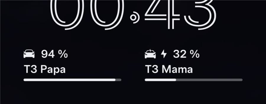
The 2-Second Check: EV Widget Micro-UX

- A single bolt icon (⚡) communicates charging instantly.
- Battery bars + % visualise state of charge without mental arithmetic.
- Side-by-side vehicles enable immediate triage: which one needs attention?
UX Laws in play
- Jakob’s Law: Lean on familiar patterns (battery bars, bolt icon) so users spend zero time learning.
- Hick’s Law: Reduce choices; show only what matters at a glance.
- Fitts’s Law: If tappable, keep targets large and close—useful on a lock screen.
Design takeaway: Micro-signals beat macro dashboards for moment-of-decision UX.
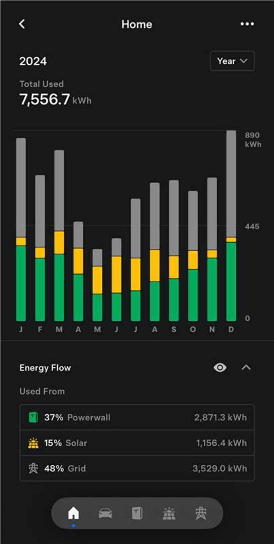
Stacked Mixes Tell the Seasonality Story


Stacked monthly bars answer three questions at a glance:
- How much did we use? (bar height)
- Where did it come from? (solar / grid / Powerwall colours)
- How do seasons change the mix? (solar swells across late spring–summer, grid reliance grows in winter)
UX Laws in play
- Miller’s Law: Stack and colour-code to chunk complexity.
- Aesthetic–Usability Effect: Clean colour mapping makes it feel easier and therefore is easier.
Energy read: In UK-like latitudes, solar share rises May–Aug; winter imports dominate. Batteries flatten the evening spike and soak up shoulder-season sun.
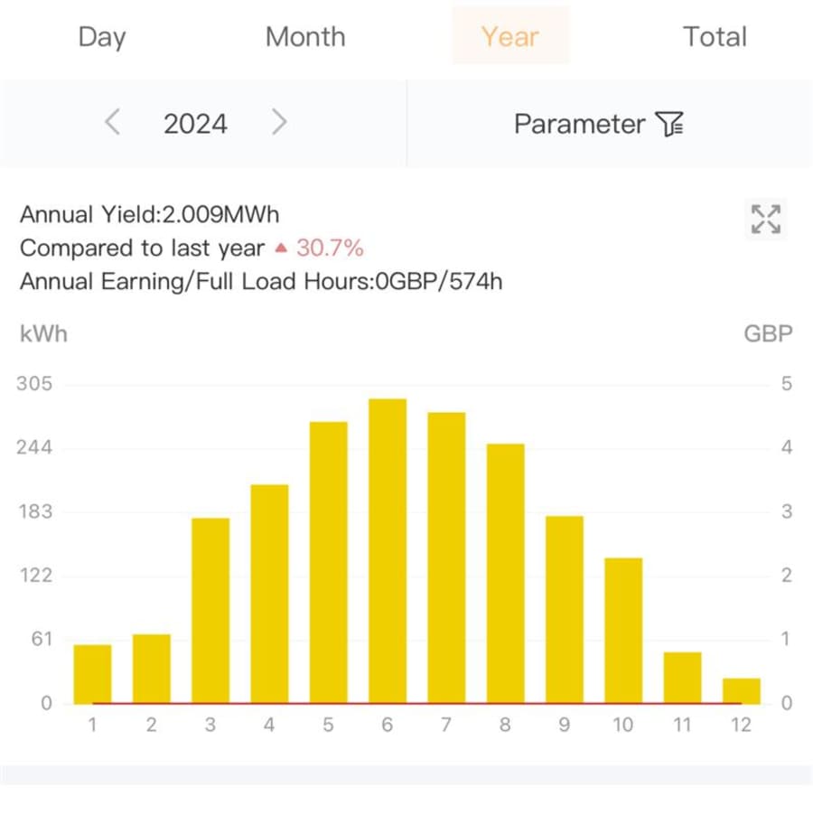
Production vs. Consumption: Two Views, One Story

- SolisCloud is a production view—great for panel output, shading issues, and month-on-month health.
- Tesla Energy is a consumption mix view—great for cost, charging schedules, and battery behaviour.
Put together:
- Panels producing fine but still importing? Likely timing or battery capacity.
- Winter grid dependency too high? Shift loads or revisit tariff/charge windows.
- EVs inflating evening peaks? Align charging with solar peaks or off-peak rates.
Turn Stats into Actions
- Shift loads: Run washers/dryers in midday sun or off-peak windows.
- Schedule EV charging: Pair solar abundance with cheap tariffs.
- Tune battery reserves: Protect overnight autonomy in winter; enable aggressive solar soaking in summer.
- Right-size storage: Use winter data to evaluate battery payback honestly.
UX principles for energy apps
- Glanceable defaults (icons, one number, one bar).
- Progressive disclosure (month → day → 15-min blocks).
- Plain-language summaries (“This month: 59% grid, 28% battery, 13% solar”).
- Helpful anomalies (“June production −18% vs last year—check shading/inverter”).
Design Patterns Worth Copying
- Consistent colour semantics (e.g., Solar = green, Grid = grey) reduce interpretation cost.
- Widget parity with app screens follows Jakob’s Law—learn once, use everywhere.
- One-tap drill-down respects Doherty Threshold—keep interactions under ~400 ms to maintain flow.
- Scenario presets (“Solar-only charge”, “Hold battery at 30%”) apply Hick’s Law—fewer, smarter choices.
A Unified “Energy Story” Screen (Concept)
- Top: Real-time status (EV charging now, battery %, import/export).
- Middle: Month-to-date stacked mix with an EV overlay.
- Bottom: Toggle between Production and Consumption Mix with season markers.
- Action card: “Shift EV charge to 00:30–04:30 to save ~£X/mo given current tariff.”
Closing Thought
The goal isn’t to make you watch charts—it’s to make trustworthy sense the moment you look.
A bolt icon, a bar, and a well-coloured stack can turn kilowatt-hours into confident choices about when to charge, when to run appliances, and whether storage or tariffs need a tweak.